
Built for the
Luminopia
Messaging & Website Redesign
Built for the
one who says yes.
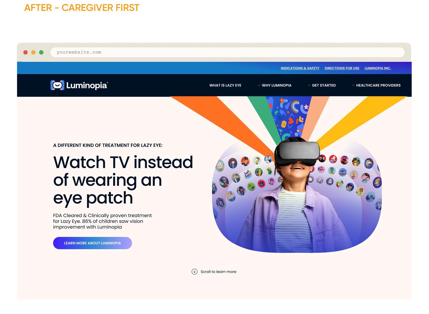
Luminopia makes an FDA-cleared VR treatment for lazy eye. I was brought in because the brand had a messaging problem — it was built to convince doctors, when the real decision was happening at home, with parents.
- CREATIVE DIRECTION
- MESSAGING STRATEGY
- TONE OF VOICE
- WEB DESIGN
- TAXONOMY & UX
The Idea
SAME PRODUCT.
WRONG AUDIENCE.
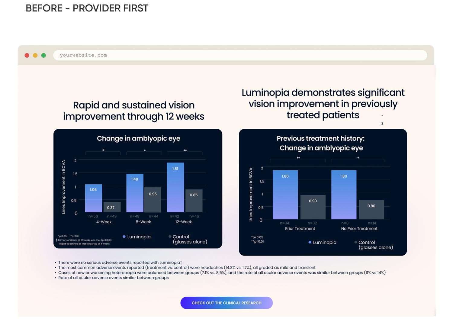
Luminopia had built its site and messaging around physicians and prescribers — clinical language, data-forward, written for someone with a medical degree. But at this stage, the company needed to sell direct to consumer. The real audience was a parent, researching alone at 11pm, trying to decide if this was worth bringing up at the next appointment.
- CREATIVE DIRECTION
- MESSAGING STRATEGY
- TONE OF VOICE
- WEB DESIGN
- TAXONOMY & UX
The Idea
SAME PRODUCT.
WRONG AUDIENCE.
Luminopia had built its site and messaging around physicians and prescribers — clinical language, data-forward, written for someone with a medical degree. But at this stage, the company needed to sell direct to consumer. The real audience was a parent, researching alone at 11pm, trying to decide if this was worth bringing up at the next appointment.
3
longer average session duration
The Work
Rebuilt for how
parents actually decide.
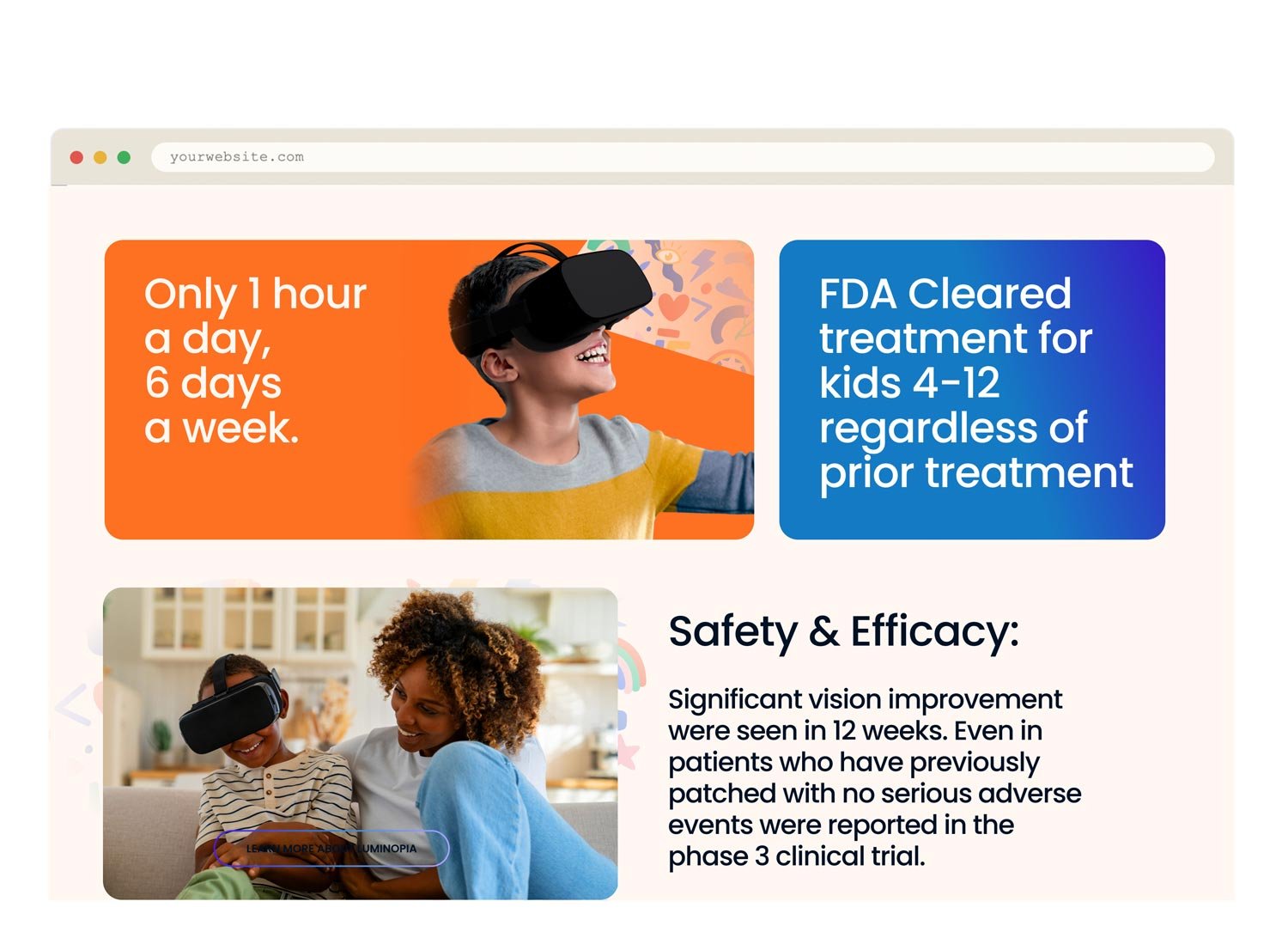
Same tone, same visual language, carried across every screen a parent might actually land on — the homepage, the mobile experience, the explainer, and the sign-up flow itself. Nothing here was designed in isolation.
3
longer average session duration
The Work
Rebuilt for how
parents actually decide.
Same tone, same visual language, carried across every screen a parent might actually land on — the homepage, the mobile experience, the explainer, and the sign-up flow itself. Nothing here was designed in isolation.
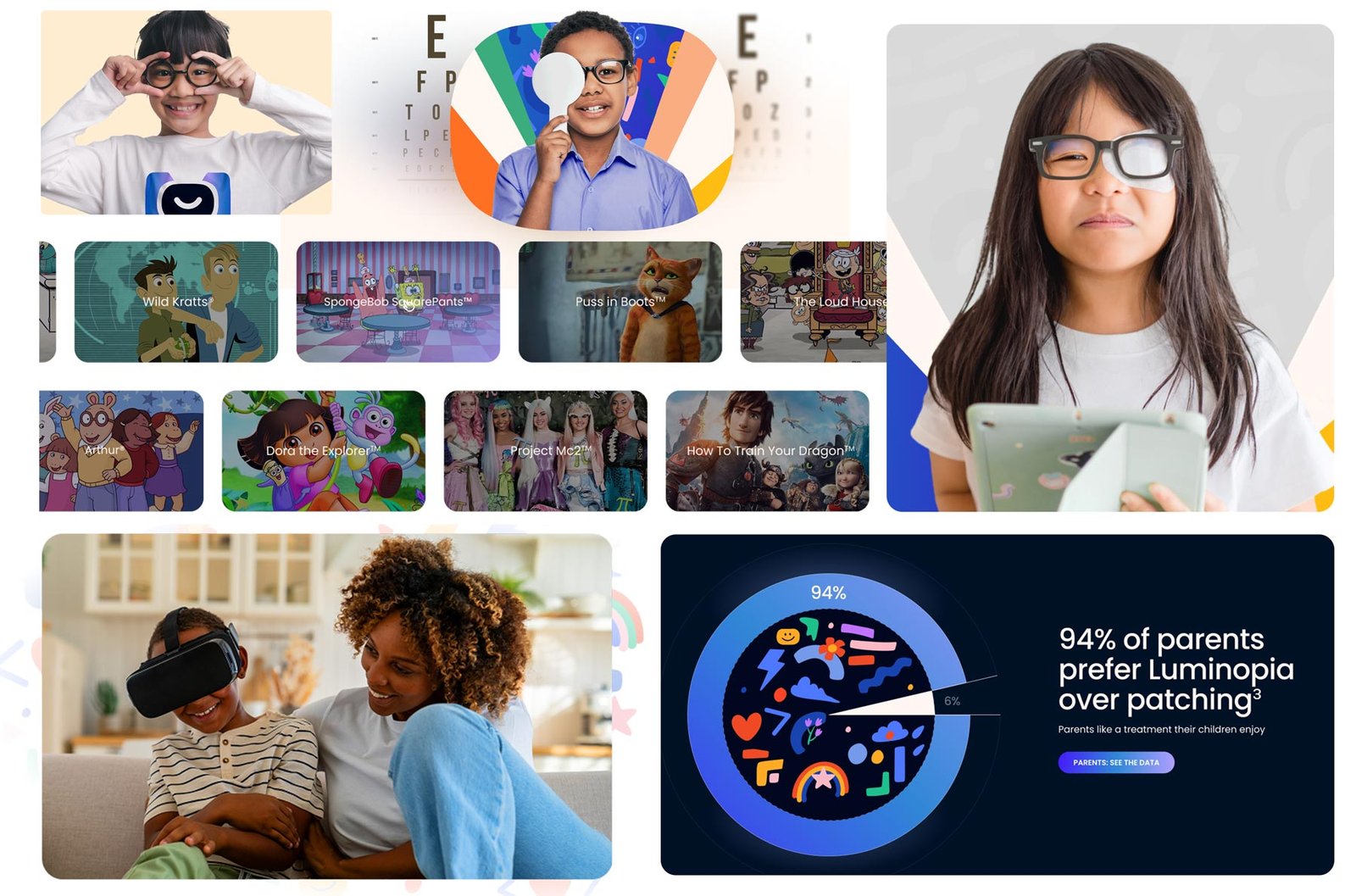
PHOTOGRAPHY & TONE: EMOTIONAL, NOT CLINICAL
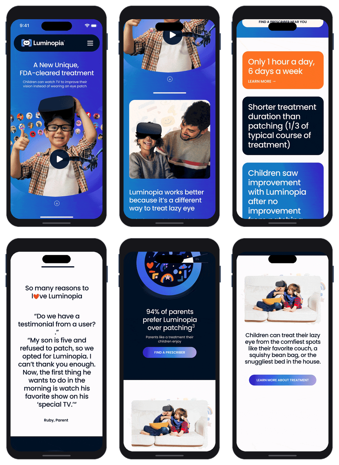
PHOTOGRAPHY & TONE:
EMOTIONAL, NOT CLINICAL
HOW IT WORK: Plain, Easy to understand language
Get Started Flow: 3 steps, no jargon
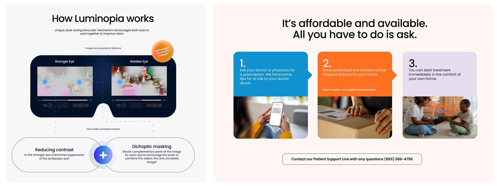
HOW IT WORK:
Plain, Easy to
understand language
Get Started Flow:
3 steps, no jargon
REAL VOICES:
Parents Testimonials,
front and center
BIG STATS: REAL FACTS
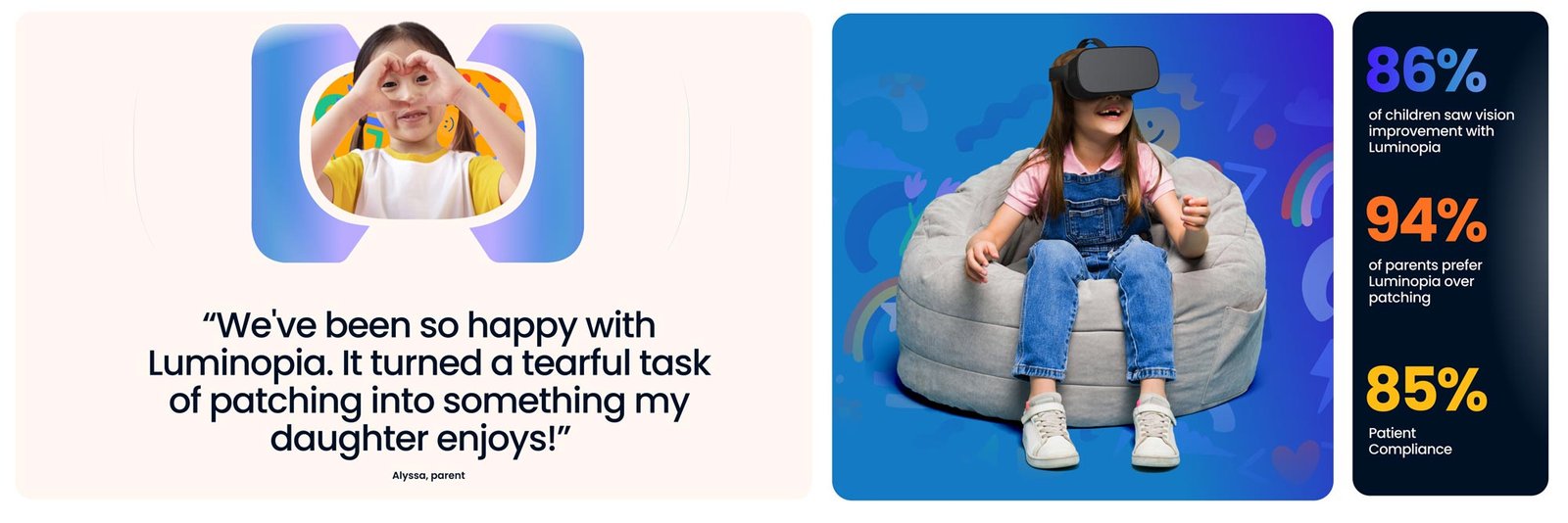
REAL VOICES:
Parents Testimonials,
front and center
BIG STATS:
REAL FACTS
The Role
Creative Director
Redesigned the website myself end-to-end in Figma — developed new consumer messaging and brand positioning, and worked across product, marketing, and clinical teams to align the brand narrative with both the user and provider journeys.
THE TAKEAWAY
The science was never the hard part — it was FDA-cleared and it worked. The hard part was writing for the person who actually had to say yes.