STEP ONE.
First things first, the logo needed to be updated because it did not reflect the goal or vision of the company. The original logo was cold, rigid, and too futuristic for a company whose goal is to be warm, welcoming and safe. I redesigned it to feel warmer and more approachable, without losing credibility.


STEP ONE.
First things first, the logo needed to be updated because it did not reflect the goal or vision of the company. The original logo was cold, rigid, and too futuristic for a company whose goal is to be warm, welcoming and safe. I redesigned it to feel warmer and more approachable, without losing credibility.
STEP TWO.
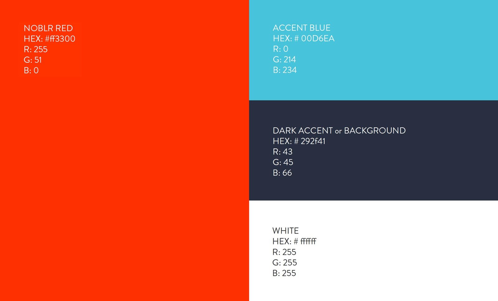
Next came a color palette built to match that same warmth — one flexible enough to carry the brand consistently across a full style guide, not just look good on a single slide.
STEP TWO.
Next came a color palette built to match that same warmth — one flexible enough to carry the brand consistently across a full style guide, not just look good on a single slide.
STEP THREE.
I chose Brandon Grotesque for headers and Open Sans for body copy — legible and scalable across every digital surface, with just enough personality to avoid reading as generic.
STEP THREE.
I chose Brandon Grotesque for headers and Open Sans for body copy — legible and scalable across every digital surface, with just enough personality to avoid reading as generic.
Primary font

Brandon Grotesque
Headers
Bold
Regular
Light
Body font

Open Sans
Body Copy
Regular
Italic
STEP FOUR.
From there, I designed a simple, mobile-first website built to explain the product’s actual value in as few words as possible.
STEP FOUR.
From there, I designed a simple, mobile-first website built to explain the product’s actual value in as few words as possible.
STEP FIVE.
The same brand and personality then had to hold up inside the product itself — the quote flow, the purchase flow, the app — refining the style guide as needed to keep every touchpoint consistent.
STEP FIVE.
The same brand and personality then had to hold up inside the product itself — the quote flow, the purchase flow, the app — refining the style guide as needed to keep every touchpoint consistent.

STEP SIX.
Finally, I circled back with what we’d learned — fine-tuning the visual identity and developing an actual tone of voice for the brand going forward.
STEP SIX.
Finally, I circled back with what we’d learned — fine-tuning the visual identity and developing an actual tone of voice for the brand going forward.